When it comes to creating the illusion of space in a room, the color of your wall tiles plays a pivotal role. The right choice can open up the area, making it feel larger and more inviting. In this detailed guide, we delve into the science and art behind choosing the perfect color for your wall tiles to maximize the perception of space.
Understanding the Impact of Color in Interior Design
Color is not merely a visual aspect; it profoundly influences our emotions and perceptions. In interior design, it serves as a powerful tool to manipulate the perception of space. Understanding the psychological impact of colors allows us to make informed choices that align with the desired ambiance.
The Science Behind Perception
Before delving into specific colors, it’s crucial to understand how our brains interpret color and space. Lighter colors tend to reflect more light, creating an airy and open atmosphere. Darker colors absorb light, resulting in a cozier, more intimate feel. This fundamental knowledge forms the basis for choosing the best wall tiles that optimize the perception of space.
Optimal Colors for Expanding Space
Lighter Shades
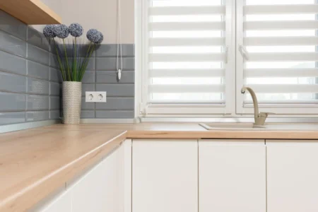
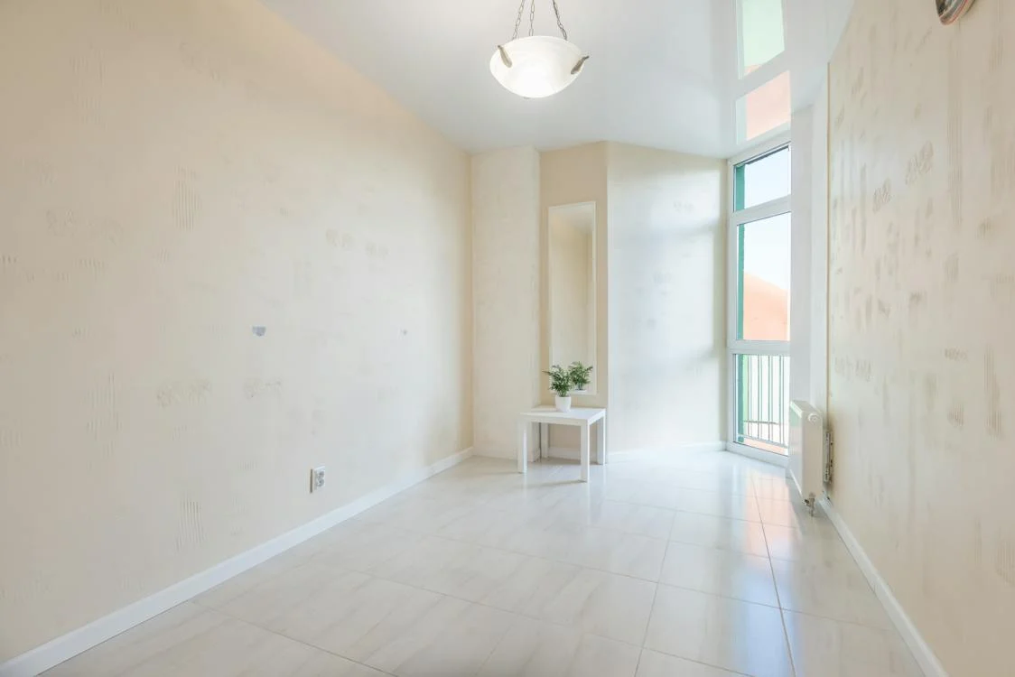
Lighter hues, such as soft whites, creams, and light grays, have a timeless appeal in creating the illusion of a larger space. These colors reflect natural light, instantly brightening the room and eliminating any sense of confinement.
Monochromatic Magic
Opting for a monochromatic color scheme, where varying shades of the same color are used, contributes to a seamless and uninterrupted visual flow. This uniformity eliminates visual clutter, making the room feel more expansive.
Mirroring the Sky with Blues
Drawing inspiration from the vastness of the sky, shades of blue evoke a sense of openness. From serene sky blues to deep navy, these tones create a visually expansive backdrop that tricks the eye into perceiving a larger space.
Choosing the Right Hue for Your Space
Neutrals
Neutrals, including beige, taupe, and greige, offer a sophisticated and timeless elegance. These tones provide a neutral canvas, allowing other design elements to stand out while maintaining an open and airy atmosphere.
Soft Greens for a Touch of Nature
Incorporating soft green tones brings a touch of nature indoors. Green has a calming effect and visually connects the space with the outdoors, creating an illusion of depth and expansiveness.
Strategic Use of Mirrors
Strategically placing mirrors can amplify the perception of space. Mirrors reflect both natural and artificial light, creating a brighter environment. When paired with the right wall tile color, this technique can significantly enhance the feeling of spaciousness.
Common Misconceptions
White Isn’t Always Right
While white is a classic choice for creating a larger feel, it’s essential to balance it with other elements. An all-white room can sometimes appear sterile; incorporating subtle contrasts and textures prevents the space from feeling too clinical.
The Myth of Dark Colors
Contrary to popular belief, dark colors can be used effectively to create an intimate and cozy atmosphere. When used strategically, dark tiles can add depth to a room without sacrificing the perception of space.
Conclusion
In the quest for the perfect wall tile color to make a room look bigger, understanding the interplay of colors and their psychological effects is paramount. From the classic appeal of lighter shades to the strategic use of mirrors, the choices are vast. Remember, there’s no one-size-fits-all solution; it’s about finding the balance that aligns with your aesthetic preferences while creating the illusion of spaciousness. Armed with this knowledge, embark on your design journey and transform your space into a visually expansive haven.
FAQs
Can warm colors make a room look bigger?
Warm colors, such as soft yellows and peach tones, can create a cozy atmosphere but may not have the same expansive effect as cooler tones. It’s advisable to strike a balance and incorporate warm hues thoughtfully.
What about patterned tiles?
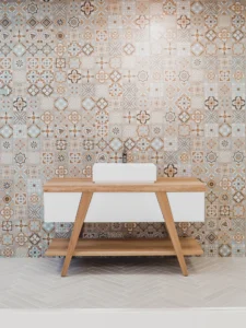
Intricate patterns can add visual interest, but they may also create a busier look. To maintain the illusion of space, opt for subtle patterns and lighter colors that won’t overwhelm the visual senses.
Should the floor color match the wall tiles?
While matching floor and wall colors can create a seamless look, it’s not a strict rule. Experimenting with complementary colors can add visual interest and depth to the room.
How does natural light affect color perception?
Natural light enhances the impact of wall colors. Rooms with ample natural light appear more spacious, so consider the orientation of your space when choosing wall tile colors.
Is it advisable to use bold, contrasting colors?
Bold colors can make a statement, but they may not be the best choice for maximizing space. If opting for contrasting colors, use them strategically in accents rather than dominating the entire room.